This application is a sample design created as part of the Google certification program.
This is a service for learners of architecture to find a partner to study with. By seeing the results of the learners they study with, users can use the service to maintain their own motivation.

My role
UX designer leading the ARCH CONNECT website design
Responsibilities
Conducting interviews, paper and digital wireframing, low and high-fidelity prototyping, conducting usability studies, accounting for accessibility, iterating on designs and responsive design
Project goal

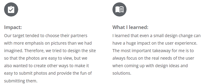
This service provides an easy way to find other users who are studying in common and stay motivated to study together.
Persona

Persona's name is Kei.
He is a Architecture students
who needs to consult with other learners when making architectural models
Because he is anxious to learn on his own.
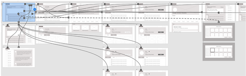
Sitemap
My goal here was to make strategic information architecture decisions that would improve overall website navigation. The structure I chose was designed to make things simple and easy.

Wireframes
I designed the web UI for both desktop and smartphone screen sizes.

Desktop
Prioritizing useful elements (such as search bar)locations and visual element placement on the home page was a key part of my strategy.
Smart phone
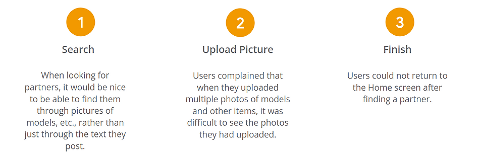
Users commented that each element was too large and spoiled the listability of the smartphone screen, so this was modified.

Low-fidelity prototype
Usability study

I conducted a usability study on four people.
Nationality: Japanese
Method: Remote
Length: 20-30min
Findings
Mock up
Based on the usability study I changed the button to upload photos. Previously, users had to press a small photo icon to upload an image, but I made the button larger and designed the uploaded image to be easily recognizable.

The design was changed to display photos in a larger size so that when looking for a partner, one can find a partner based on photos of models and other items.

Final design


Smartphone
My hi-fi prototype followed the same user flow as the lo-fi prototype, and included the design changes made after the usability study, as well as several changes suggested by members of my team.


Going forward
Takeaways